Minimalist data visualizations aren't necessarily ideal: The Story of Goldilocks and the Three Charts
Abstract
Aspiring to minimalism is common when you’re designing a data visualization. Minimalism is often treated as ideal for understanding a graph quickly, but sometimes ‘wasting ink’ makes sense to add emotion and engagement. This article argues for a “Goldilocks” balance between data and decoration, showing example cases where more ‘chartjunk’ improve clarity, comprehension, and attention depending on context. Effective visualizations should calibrate design choices to audience and purpose. But, empirical research on the ideal data-ink ratio of visualizations is are.

Figure 1:The balance between data-ink and chartjunk in data visualizations
Sources: Darkhorse Analytics Blog - Data Looks Better Naked, Visual Business Intelligence - The Chartjunk Debate
Best practices in data visualization often suggest minimizing decoration on your data viz and maximizing the data itself. But a recent review of literature on data visualization suggested that striking an optimal balance between ‘data and decoration’ on your chart can improve the focus and clarity of chart/graph design McGurgan et al. (2021).
A high data-ink ratio, that is, a high proportion of ink or pixel encoding data or information, will make your charts and figures really stand out. However, this comes at the cost of losing some of the visual cues and signals that will help draw attention to it. Hence it is important to find the right balance for your purpose and audience.
Chartjunk is stuff on your graph that’s not communicating actual data
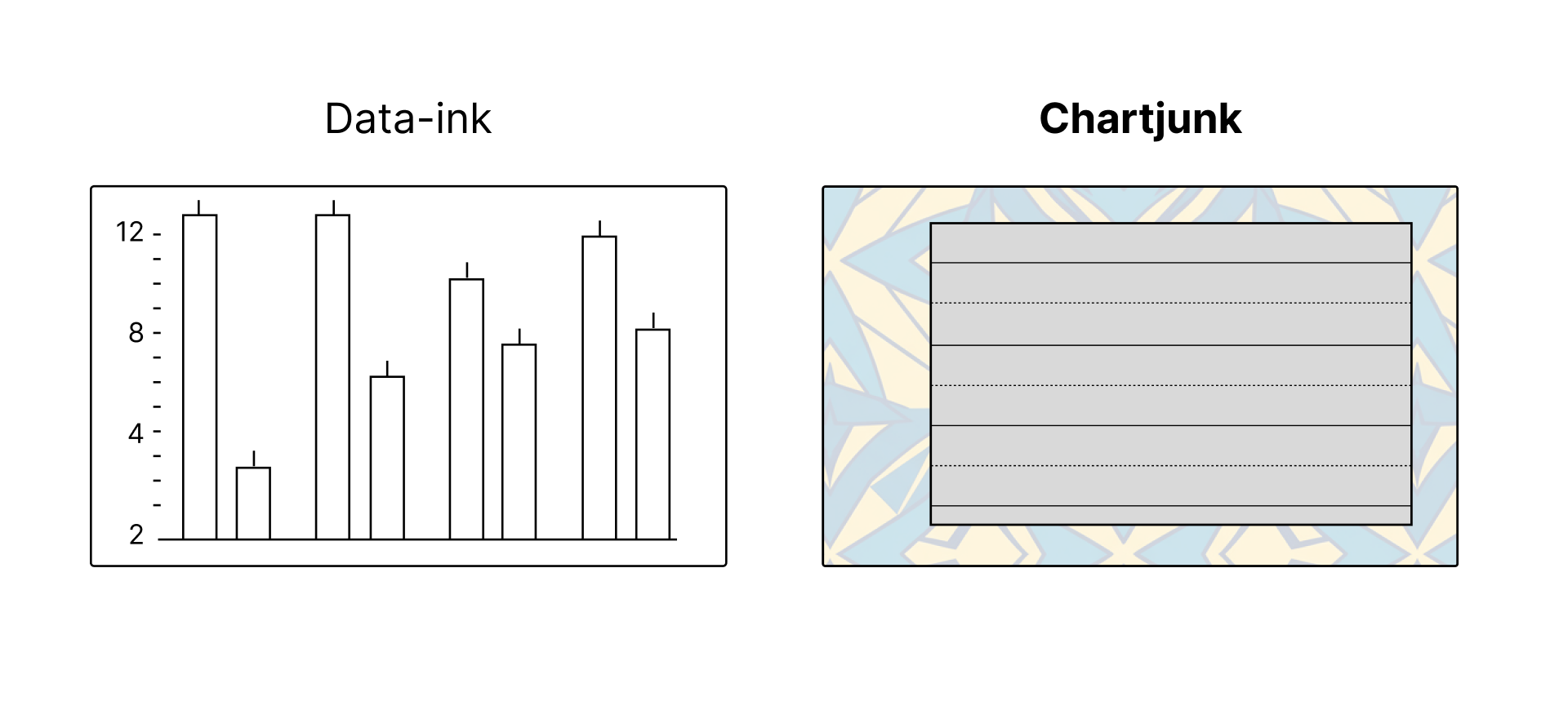
Figure 2:Data ink vs. Chartjunk
Data-ink is the total ink on a graph that represents data. The non-erasable core of the graphic, the non-redundant ink representing or encoding data information." Everything else is Chartjunk Tufte (2001).
Data-ink ratio is like the signal-to-noise ratio of the graph:
Data ink ratio = data-ink / total ink used to print the graphic.
You can also think of data-ink ratio as the proportion of a graphic’s ink devoted to the non redundant display of data information. Or, 1.0 - (one minus) the proportion of a graphic that can be erased without loss of data information
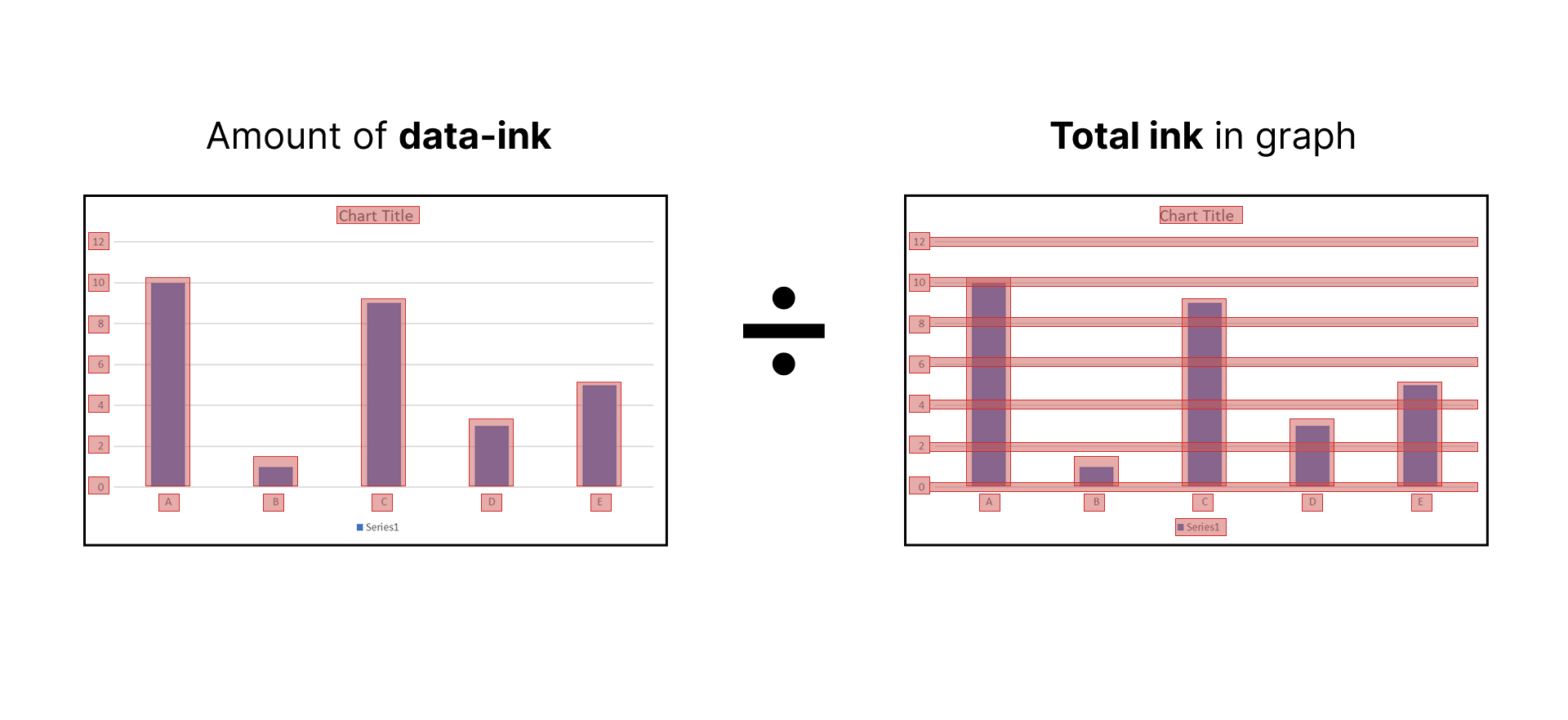
Figure 3:Data ink ratio
Famous data visualization expert Edward Tufte argued for less chartjunk (higher data-ink ratio, more minimalism)
“Perfection is achieved not when there is nothing more to add, but when there is nothing left to take away” – Antoine de Saint-Exupery
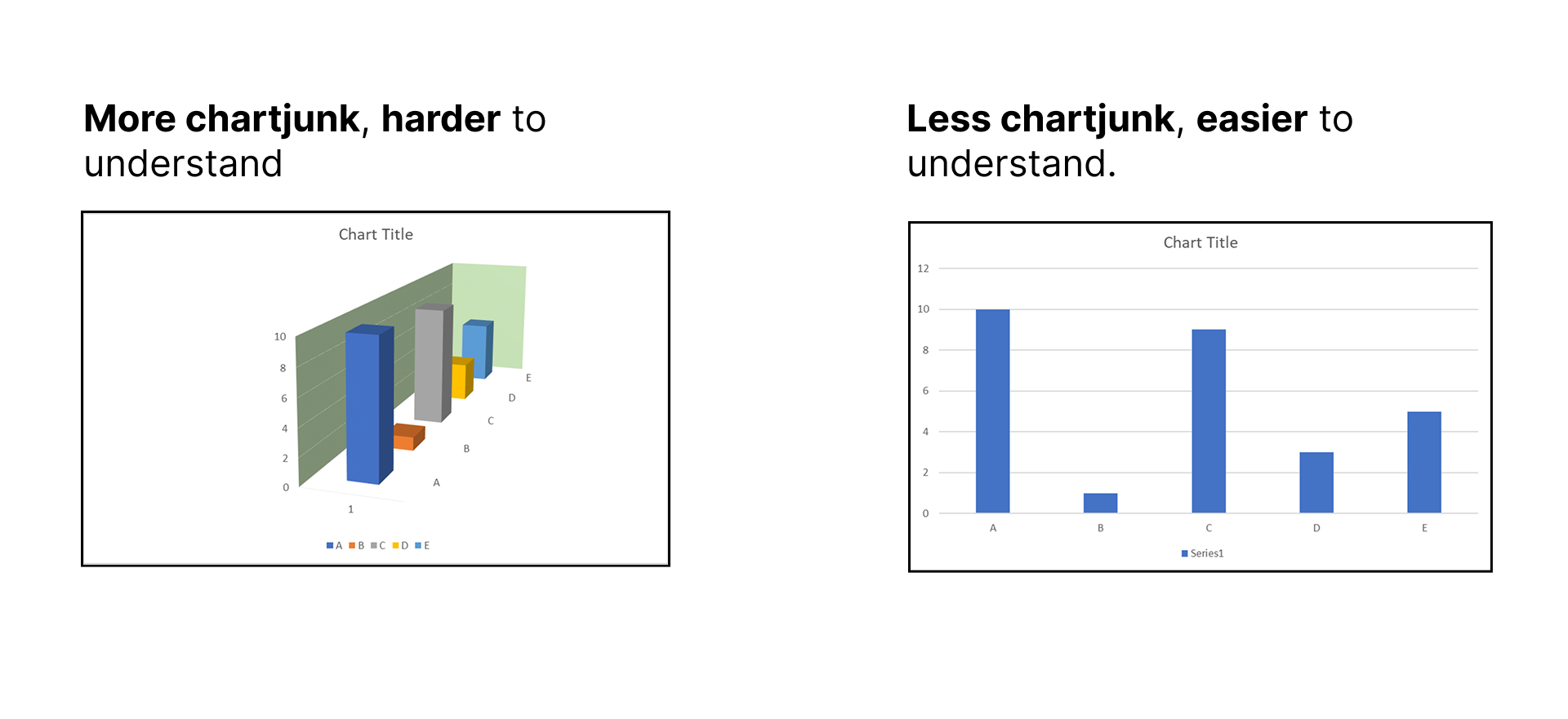
Figure 4:Chartjunk can make graphics harder to understand
We have Edward Tufte to thank for elegantly relating the informativeness of data visualization to the ‘signal-to-noise’ ratio concept. Edward Tufte asserts that good graphical representations maximize data-ink (the signal) and remove graphics that serve to embellish but does not add to the information (the noise or ‘chartjunk’ Tufte (1983)).
Tufte argued for minimal, ‘zero chartjunk’ figures. Everything on this graph is literal data. Or, data-ink. (maximum possible data-ink ratio).
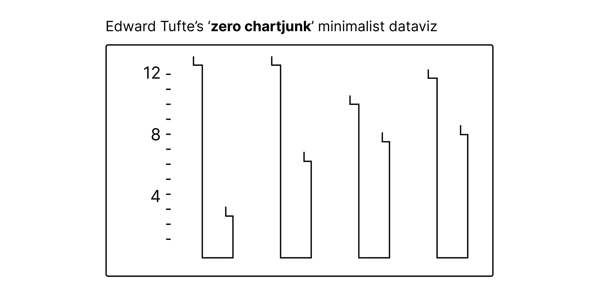
Figure 5:Tufte’s answer to ‘junky’ graphs: A pure, minimalist graph with no unnecessary ink.
Theoretically speaking, a higher data-ink tends to lead to less clutter and more clarity (because a higher proportion of the visual content encodes information), which should result in better recall Ajani et al. (2021),
But trying to eliminate all chart junk comes at cost to usability
“The difference between medicine and poison is the dosage”
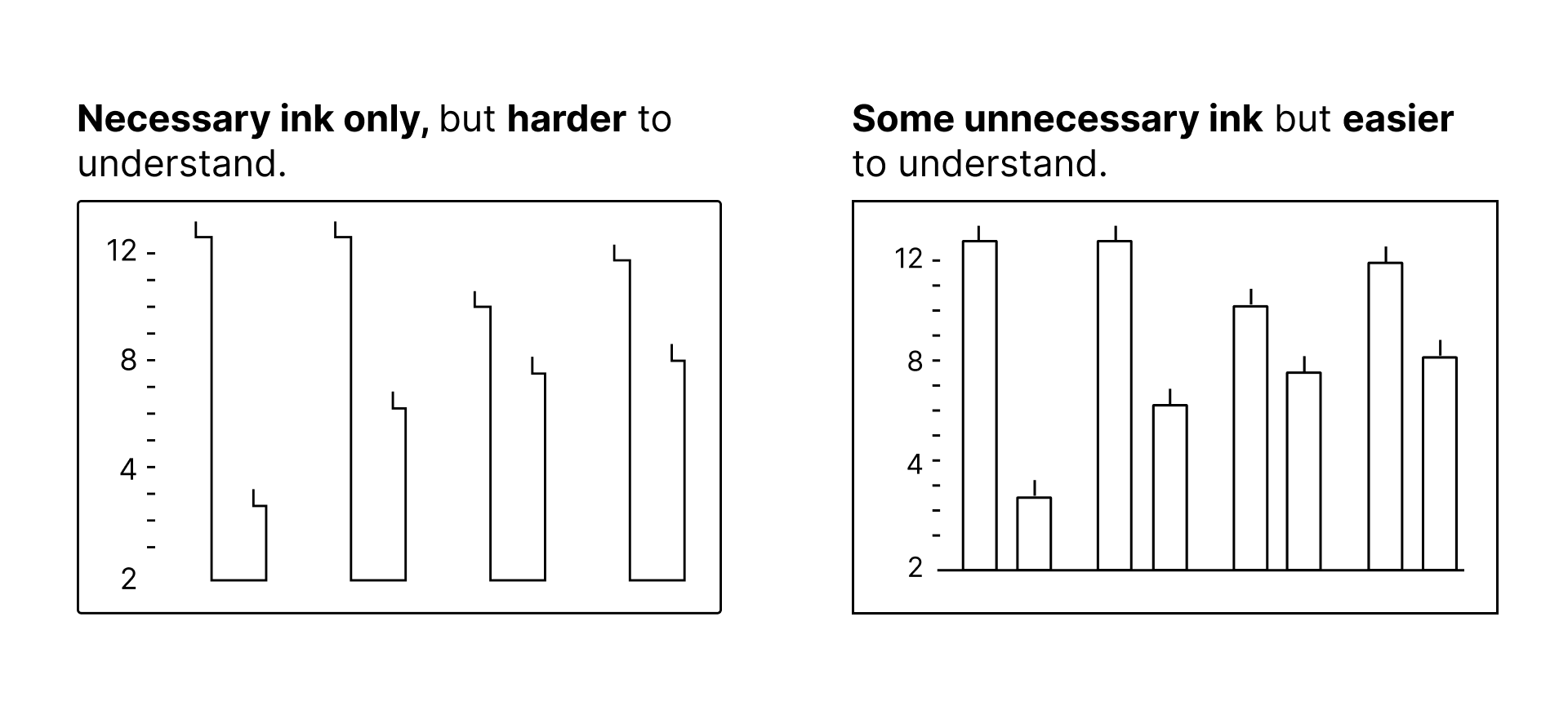
Figure 6:Minimalist graph has necessary ink only, but is also harder to understand (and less familiar). Adding a dash of uncessary ink chartjunk actually makes the graph a bit easier to understand.
Some extra ink — bigger font, more labels on axis, axis lines — can add clarity, even if they aren’t fully necessary.
And sometimes, visually embellished graphics can also make your data more engaging.
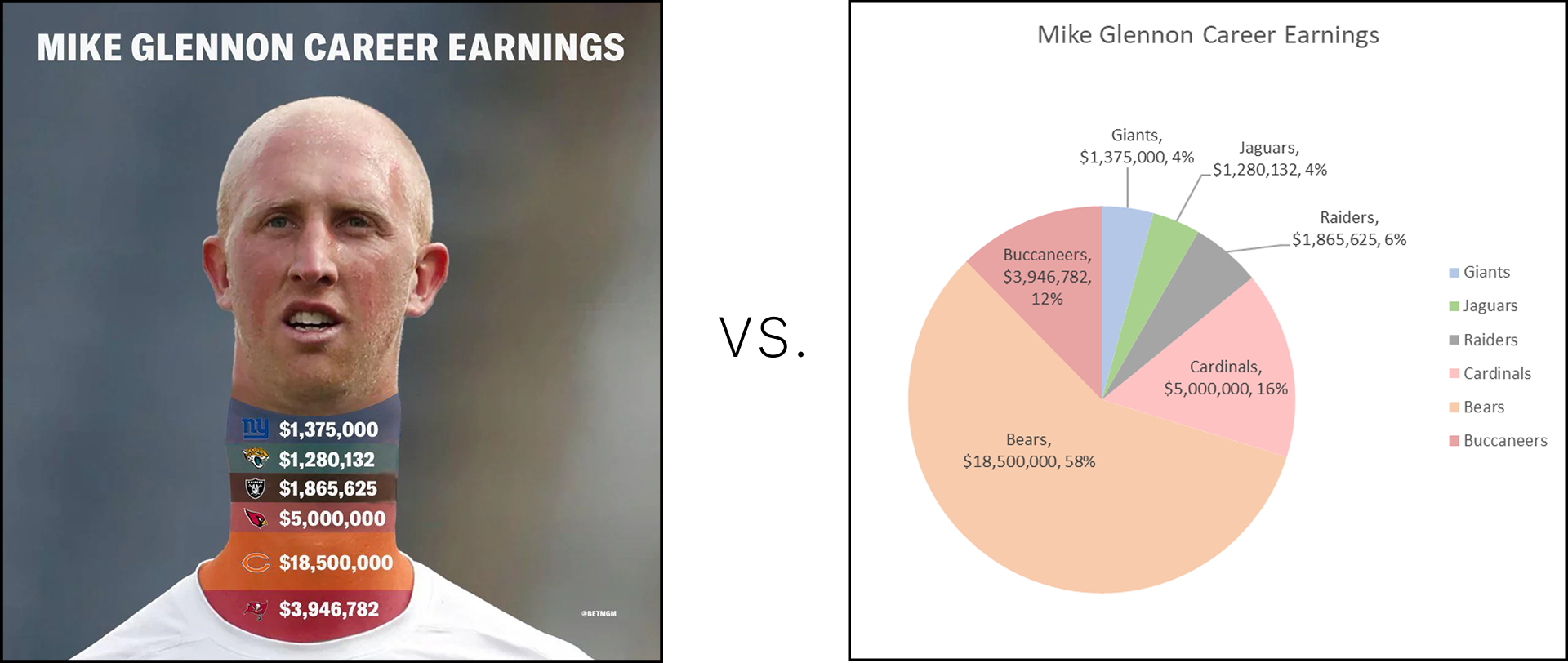
Figure 7:Everything besides the dollar amounts, and the thickness of the neck bars is technically chart junk.
Note that this was retweeted 2,700+ times. Would the author have seen the same engagement from purely minimizing ‘chart junk’?
In your data visualizations, usually aim for a ‘Goldilocks’ balance for data-ink and chart junk.
A potential approach to solving this problem would be to consider the story of Goldilocks and the Three Bears, in which the main character tested each of the three sets of porridges, chairs and beds to find the one that was just right for her.

Figure 8:Two contrasting examples: One where dialing up chartjunk is fully bad; the second where more chartjunk makes the data more engaging, although slower to understand.
Source: Visual Business Intelligence - The Chartjunk Debate
Limitations: There isn’t a lot of good research on these effects, in part because it’s difficult to quantify ‘chart junk’.
Chartjunk has become a popular yet contentious topic Parsons & Shukla (2020). And like many long-standing debates, this one has “rarely been conducted in a rational, evidence-based manner. It has mostly been fueled by people’s blind commitment to one camp or the other.” Few (2011)
While there are use cases for extreme minimalism, there are legitimate contexts where visual embellishment can help accomplish objectives that pure data encoding ink cannot Bateman et al. (2010).
A lot of the design flaws (intentional or otherwise) seen in the graphics and charts can be categorized Lan & Liu (2024), and their impact on the data-ink ratio can be understood. However, not all of these design flaws move the data-ink ratio in the same direction.
The challange: we need to be able to judge and quantify data-ink ratio, and its change in the context of design decisions that we make. That’s the challenge and direction that we should proceed towards if we want to improve our understanding of the value and impact of data-ink ratio: more objective measures.
To find optimal data-ink ratio, try converting to black & white
Start with black & white or grayscale, even in Excel. Look for too many contrasting elements, or not enough contrast.
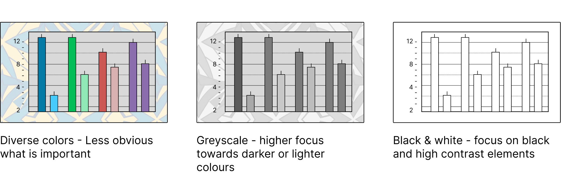
Figure 9:Converting the same chart to grayscale and then black & white reveals data-ink beneath the clutter
References
Copyright © 2025 Lai & Morrison. This is an open-access article distributed under the terms of the Creative Commons Attribution 4.0 International license, which enables reusers to distribute, remix, adapt, and build upon the material in any medium or format, so long as attribution is given to the creators.
- McGurgan, K., Fedoroksaya, E., Sutton, T. M., & Herbert, A. M. (2021). Graph Design: The Data-Ink Ratio and Expert Users. Proceedings of the 16th International Joint Conference on Computer Vision, Imaging and Computer Graphics Theory and Applications (VISIGRAPP 2021) - IVAPP, 188–194. 10.5220/0010263801880194
- Tufte, E. R. (2001). The Visual Display of Quantitative Information. Graphics Press.
- Tufte, E. R. (1983). The Visual Display of Quantitative Information. Graphics Press.
- Ajani, K., Lee, E., Xiong, C., Knaflic, C. N., Kemper, W., & Franconeri, S. (2021). Declutter and Focus: Empirically Evaluating Design Guidelines for Effective Data Communication. IEEE Transactions on Visualization and Computer Graphics.
- Parsons, P. C., & Shukla, P. C. (2020). Data Visualization Practitioners’ Perspectives on Chartjunk. 2020 IEEE Visualization Conference (VIS), 211–215.
- Few, S. (2011). The Chartjunk Debate. https://perceptualedge.com/articles/visual_business_intelligence/the_chartjunk_debate.pdf
- Bateman, S., Mandryk, R. L., Gutwin, C., Genest, A., McDine, D., & Brooks, C. (2010). Useful Junk? The Effects of Visual Embellishment on Comprehension and Memorability of Charts. Proceedings of the SIGCHI Conference on Human Factors in Computing Systems (CHI ’10), 2573–2582.
- Lan, X., & Liu, Y. (2024). “I Came Across a Junk”: Understanding Design Flaws of Data Visualization from the Public’s Perspective. IEEE Transactions on Visualization and Computer Graphics, 31, 393–403.